


Why Traffic Doesn’t Always Turn Into Leads on a Landing Page
Traffic shows up. Clicks increase. The page receives attention, yet something feels off.
Searches for landing page optimization tips for more leads often begin at that exact point. Activity exists, but results don’t follow in the same direction.
Visitors arrive, scroll, and leave. No clear signal explains why. The offer seems fine. The design looks acceptable. Still, conversions stay low.
That gap creates a different kind of pressure. Effort continues, but outcomes remain inconsistent. Small changes get tested. Headlines shift. Buttons move. The pattern rarely improves in a meaningful way.
The issue usually sits deeper than surface adjustments. Attention is present. Decisions are not.
Why Most Landing Page Optimization Tips Fail to Improve Conversions
Most advice around landing page optimization starts with visible elements. Change the layout. Adjust the colors. Improve the design. The assumption feels logical, yet results often remain unchanged.
In many cases, landing page optimization tips focus on what can be seen rather than how decisions are made. A page may look polished and still fail to guide action. Visual improvement does not always translate into clarity.
The problem usually sits beneath the surface. Visitors are not deciding, not because the page looks weak, but because the message does not resolve their hesitation.
Common patterns appear again and again:
- Visual changes without clarity
Design improves, yet the core message remains unclear. - Focusing on layout over intent
Structure changes, while user motivation is ignored. - Copying landing page best practices blindly
Tactics get applied without understanding the context behind them.
Landing page optimization tips work differently when the focus shifts from appearance to decision behavior.
What Prevents Visitors From Taking Action on a Landing Page
Conversion rarely drops for a single reason. Small points of friction build up. The page receives attention, yet decisions slow down.
Understanding these patterns is central to landing page conversion optimization. Each one affects how easily a visitor moves forward.
Unclear Value Proposition:
Visitors try to understand what is being offered within seconds. When the message feels vague or too broad, attention fades quickly.
Clarity matters more than creativity here. A strong offer loses impact when the value is not immediately obvious.
Too Many Decisions at Once:
Some pages ask for too much at the same time. Multiple options, competing messages, or unclear next steps create hesitation.
When attention splits, action slows. A single clear path often performs better than several competing directions.
Lack of Trust Signals:
Visitors look for reassurance before sharing information or taking action. Absence of credibility makes even strong offers feel uncertain.
Trust signals do not need to be complex. Small indicators of reliability often influence decisions more than design changes.
Mismatch Between Expectation and Page:
A disconnect between the ad, search result, or link and the landing page creates friction. Visitors arrive expecting one thing and encounter something slightly different.
That gap reduces confidence. Even small mismatches can affect how users respond and whether they continue.
Improving how these elements work together helps improve landing page conversion rate more effectively than surface-level changes.
How Landing Pages Guide Visitors Toward a Clear Decision
A landing page does not need to convince everyone. It needs to make the next step obvious for the right person.
Clarity carries more weight than persuasion. When user intent meets a message that feels easy to understand, hesitation reduces. Visitors spend less time figuring things out and more time deciding whether the offer fits.
Friction often appears when the page tries to say too much or guide in multiple directions. A focused structure helps attention move naturally toward a single outcome.
A few decisions must remain clear throughout the page:
- What is being offered
The value should be understood without effort. - Who it is for
Visitors should quickly recognize whether the offer applies to them. - What happens next
The call to action should feel straightforward and expected.
Decision clarity improves when these elements stay visible and consistent.

Common Friction Points That Reduce Landing Page Conversions
Small obstacles often carry more impact than major design changes. A page may look complete, yet a few friction points quietly interrupt the path toward action.
- Long or complex forms
Every extra field increases effort. Form friction builds quickly, especially when the value is not clear enough to justify the time. - Unnecessary content
Additional sections, repeated information, or weak explanations increase cognitive load. Visitors begin scanning instead of deciding, which often raises bounce rate. - Competing messages
Multiple offers or mixed directions divide attention. A page works better when one clear message stays consistent throughout. - Weak call to action
A call to action that feels vague or generic slows decisions. Visitors hesitate when the next step is not clearly defined.
Page experience improves when these friction points are reduced rather than redesigned.
What Consistently Improves Landing Page Conversion Rates
Conversion rarely improves from isolated changes. Progress usually comes from a few consistent principles applied over time.
Clarity Before Creativity:
A clear message carries more impact than a creative one. Visitors decide faster when the offer is easy to understand.
Design and visuals support that message, but they do not replace it. Clarity reduces hesitation, which helps improve landing page conversion rate more reliably than stylistic changes.
Alignment With Traffic Source:
Visitors arrive with a certain expectation. Ads, search queries, or links shape that expectation before the page loads.
When the landing page reflects that same intent, the experience feels continuous. Misalignment creates friction, even when the content appears strong.
Reducing Cognitive Load:
Too many choices or too much information slows decision-making. Simplicity helps attention stay focused.
Clear structure, fewer distractions, and direct messaging make it easier for visitors to move forward without overthinking.
Building Trust Gradually:
Trust does not appear instantly. It builds through small signals—consistency, clarity, and credibility.
Elements that support trust contribute directly to conversion rate optimization. Visitors respond more confidently when the page feels reliable and aligned with their expectations.
Why Increasing Traffic Alone Doesn’t Increase Lead Generation
More traffic often feels like progress. Numbers rise, visits increase, and activity looks stronger on the surface. The expectation is simple. More visitors should mean more leads.
In practice, the relationship is not that direct.
Visitors arrive with different levels of intent. Some are exploring. Others are comparing. Only a portion are ready to take action. When readiness is low, additional traffic does not automatically improve outcomes.
The gap between traffic and conversion usually reflects quality, not volume. A page may attract attention, yet fail to match what visitors were expecting or willing to do at that moment.
Questions around how to get more leads from landing page performance often point back to this mismatch. Lead generation improves when the right audience meets a clear and relevant message, not simply when more people arrive.
A clearer landing page experience often improves how visitors respond. The difference becomes more visible when supported by a structured approach to lead generation.
A More Practical Way to Approach Landing Page Optimization
Optimization rarely happens through a single change. A page improves gradually as patterns become clearer and decisions are refined over time.
Many searches for landing page optimization tips for more leads begin with the expectation of quick fixes. In practice, conversion improves when the focus shifts toward how visitors think, not just how the page looks.
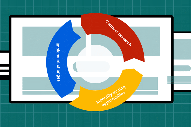
A more grounded conversion strategy treats optimization as an ongoing process. Behavior is observed, friction is reduced, and clarity is strengthened step by step.
A few shifts help guide that process:
- View optimization as continuous
Pages evolve as user behavior becomes more visible. - Focus on how decisions are made
Attention, hesitation, and intent shape outcomes more than design alone. - Prioritize clarity over constant changes
Fewer, more meaningful improvements often perform better than frequent adjustments.
Conversion improves when optimization follows behavior instead of chasing isolated tactics.
Better Conversions Start With Clear Decisions, Not More Changes
Landing pages often carry more pressure than they should. When results don’t improve, the instinct is to change something quickly. Layout shifts. Headlines get rewritten. Elements move.
The process becomes reactive.
Conversion usually improves in a different way. Clarity builds gradually. Messages become easier to understand. Decisions feel simpler for the visitor.
Fewer changes, made with more intention, tend to move things forward.
Frustration fades when the focus shifts from constant adjustment to clear direction.